The title header lacks sufficient visual prominence due to its small size & menu Icons are too small.
Title Focuses on the outcome without introducing the Product.
Hover state lacks sufficient color contrast for accessibility.
The button label is unclear and does not communicate what users can expect when they click it.
Multiple scrolling icons compete for attention and distract from primary content.
The title should use title case.
Excessive white space results in an unbalanced layout.
Excessive use of multiple colors Creates visual noise.
Poor visual hierarchy makes it difficult to determine what to read first.
The product is introduced without context, moving directly to benefits before explaining what the product is.
The focus is on the physical knob instead of the user benefit (adjustable pressure).
An unstructured layout and small text reduces readability.
The interface allows scrolling even though only two images are present.
The background image is improperly scaled, resulting in distortion.
icons are undersized.
Excessive White Space
The product description is poorly placed making it easy for users to miss.
Reviews are difficult to read over the images.
Overly bold color usage creates an unrefined look.
inconsistent title alignment reduces visual clarity.
Background elements should be minimized so the product remains the primary focus.
A mix of bold and regular font weights creates inconsistency.
White Space.
Inconsistent text alignment reduces clarity and polish.
The button is not centered.
The button label is unclear and does not communicate what users can expect when they click it.
Button shapes are inconsistent across the interface.
ORIGINAL


![Footer [footer] 1](https://static.wixstatic.com/media/7a9399_6a74dc05caca482dafa0e9f5243b6ea5~mv2.png/v1/fill/w_980,h_267,al_c,q_85,usm_0.66_1.00_0.01,enc_avif,quality_auto/7a9399_6a74dc05caca482dafa0e9f5243b6ea5~mv2.png)


REDESIGN


![Footer [footer] (1) 1](https://static.wixstatic.com/media/7a9399_cc80d04cfa4e46a7bc2cff63011bcdc7~mv2.png/v1/fill/w_980,h_296,al_c,q_85,usm_0.66_1.00_0.01,enc_avif,quality_auto/7a9399_cc80d04cfa4e46a7bc2cff63011bcdc7~mv2.png)
20
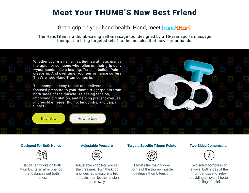
updated the landing text to introduce Hand Titan as the product.
Revised the hover state to meet accessibility standards.
Added a second button to provide clear calls to action for purchasing or learning about Hand Titan.
Removed scrolling Icons to limit visual distractions.
Adjusted the title size to improve visual hierarchy.
Enlarged the selected photo and repositioned it in the background.
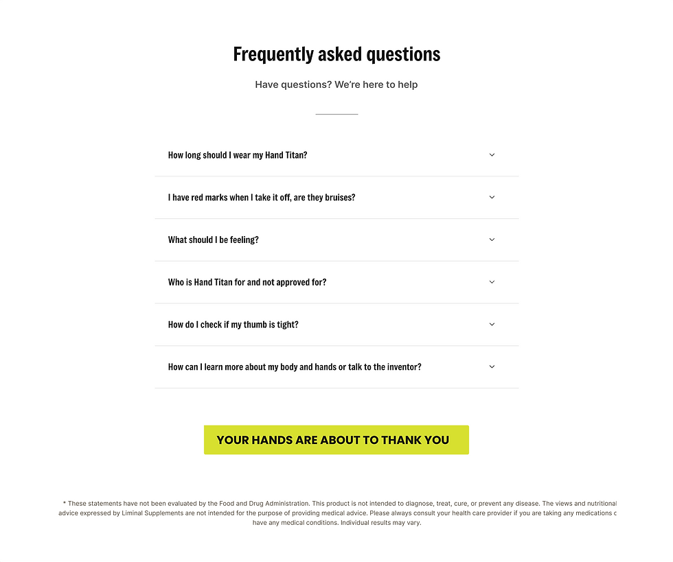
Isolated the qualifying questions from the marketing statement to improve clarity and flow.
Added a clear product introduction and description in the same place
Shifted focus from the physical knob to the pressure benefit.
Increased the title logo size to strengthen brand visibility and improve visual layout; adjusted size of menu icons
Introduced logo breaks to divide content sections.
Provided distraction-free diagrams
Added clearer, more detailed instructions.
Resized the background image to improve visual balance.
Adjusted icon size and removed excessive white space.
Added color to the iconography.
Reformatted the content.
Introduced a visual indicator to highlight the available discount.
Unified the card color and introduced the Hand Titan vector image into the card backgrounds.
Aligned all the card titles and icons.
Reorganized the content with a clear structure to improve readability.
Eliminated the scroll interaction and added more images of users with the product.
Added an overlay behind the text to improve visibility against the images in the backgrounds.
Moved the reviews to the bottom of the page.
Hand Titan
GOAL: To evaluate the UI and content to improve UX by refining information flow, content organization, visual appeal, and layout while preserving existing content.
Scroll within the sections below to view both the original and redesigned webpages, alongside my analysis provided in the margins.
Ensured visual consistency by reusing “Shop” components on the Home page.
Moved FAQs and About Us to dedicated pages to improve site structure.
Redesigned layouts across all pages.

Title Focuses on the outcome without introducing the Product.
Hover state lacks sufficient color contrast for accessibility.
The title header lacks sufficient visual prominence due to its small size & menu Icons are too small
The button label is unclear and does not communicate what users can expect when they click it.
Multiple scrolling icons compete for attention and distract from primary content.
The title should use title case.
Excessive white space results in an unbalanced layout.
Excessive use of multiple colors Creates visual noise.
Poor visual hierarchy makes it difficult to determine what to read first.
The product is introduced without context, moving directly to benefits before explaining what the product is.
The focus is on the physical knob instead of the user benefit (adjustable pressure).
An unstructured layout and small text reduces readability.
The interface allows scrolling even though only two images are present.
The background image is improperly scaled, resulting in distortion.
icons are undersized.
Excessive white space.
The product description is poorly placed making it easy for users to miss
Reviews are difficult to read over the images.
inconsistent title alignment reduces visual clarity.
Overly bold color usage creates an unrefined look
Background elements should be minimized so the product remains the primary focus.
A mix of bold and regular font weights creates inconsistency.
Inconsistent text alignment reduces clarity and polish.
White space?
The Button is not centered.
The button label is unclear and does not communicate what users can expect when they click it.
Button shapes are inconsistent across the interface.
ORIGINAL
Show Notations
Hide Notations
![Image [header__logo-image]](https://static.wixstatic.com/media/7a9399_979e5e0dd1e44685bd78678054b6f695~mv2.png/v1/fill/w_200,h_195,al_c,q_85,enc_avif,quality_auto/7a9399_979e5e0dd1e44685bd78678054b6f695~mv2.png)
Redesign
Show Notations
Hide Notations
updated the landing text to introduce Hand Titan as the product.
Revised the hover state to meet accessibility standards.
Removed scrolling Icons to limit visual distractions.
Adjusted the title size to improve visual hierarchy.
Enlarged the selected photo and repositioned it in the background.
Increased the title logo size to strengthen brand visibility and improve visual layout; adjusted size of menu icons
Added a second button to provide clear calls to action for purchasing or learning about Hand Titan.
Isolated the qualifying questions from the marketing statement to improve clarity and flow.
Added a clear product introduction and description in the same place
Shifted focus from the physical knob to the pressure benefit.
Introduced logo breaks to divide content sections.
Provided distraction-free diagrams
Added clearer, more detailed instructions.
Resized the background image to improve visual balance.
Reformatted the content.
Introduced a visual indicator to highlight the available discount.
Adjusted icon size and removed excessive white space.
Added color to the iconography.
Unified the card color and introduced the Hand Titan vector image into the card backgrounds.
Aligned all the card titles and icons.
Reorganized the content with a clear structure to improve readability.
Eliminated the scroll interaction and added more images of users with the product.
Added an overlay behind the text to improve visibility against the images in the backgrounds.
Moved the reviews to the bottom of the page.
.png)
Shop
About Us
FAQs
you are here
you are here
you are here

.png)
.png)
.png)
1
Ensured visual consistency by reusing “Shop” components on the Home page.
2
Moved FAQs and About Us to dedicated pages to improve site structure.
3
Redesigned layouts across all pages.
Menu
Removed “search” as it produced worse results than menu navigation
Menu
.png)
.png)
.png)